Fruit Studio (Sustainable Design, Spring 2021)
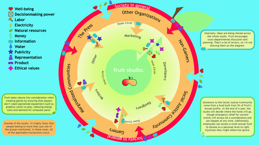
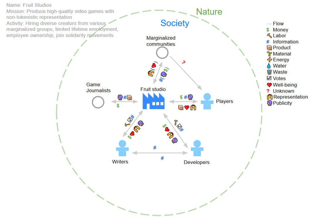
As a final for the Sustainable Design course I took in my senior year, we were tasked with imagining a sustainable organization, and creating slides to explain our creation to our classmates. As a fan of video games, a game studio instantly came to mind, and having watched the recent success of Supergiant's 2020 hit Hades and the parallel controversial release of CD Projekt Red's Cyberpunk 2077, I had some thoughts about how the health of the employees directly impacts the quality of the game on release.Being given a template, we created value flow diagrams like the one seen below.
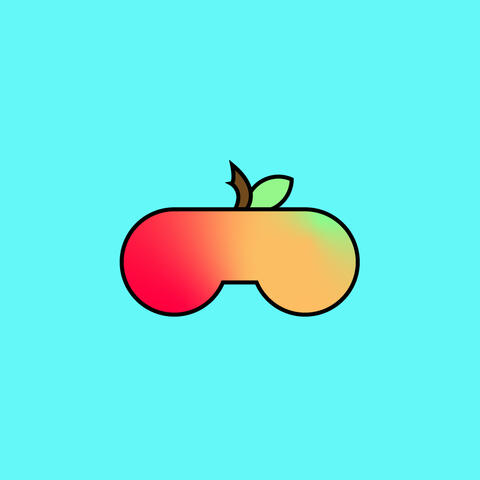
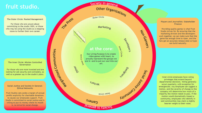
We then practiced a few different methods of visualization. I realized that my organization had several layers, and decided to make a visual pun based on the studio's name.
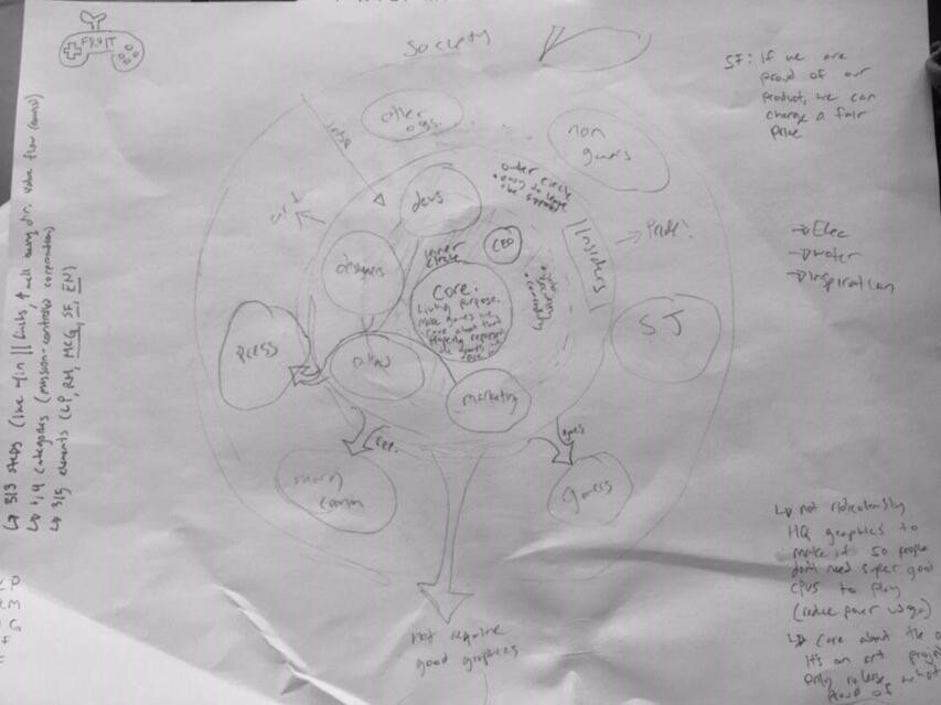
The image above was digitized, and I settled on an aesthetic for the final slides. Bright colors, simple text, sans-serif font all communicate modernity, simplicity, and friendliness, which fit with the studio's goal of promoting employee wellness.
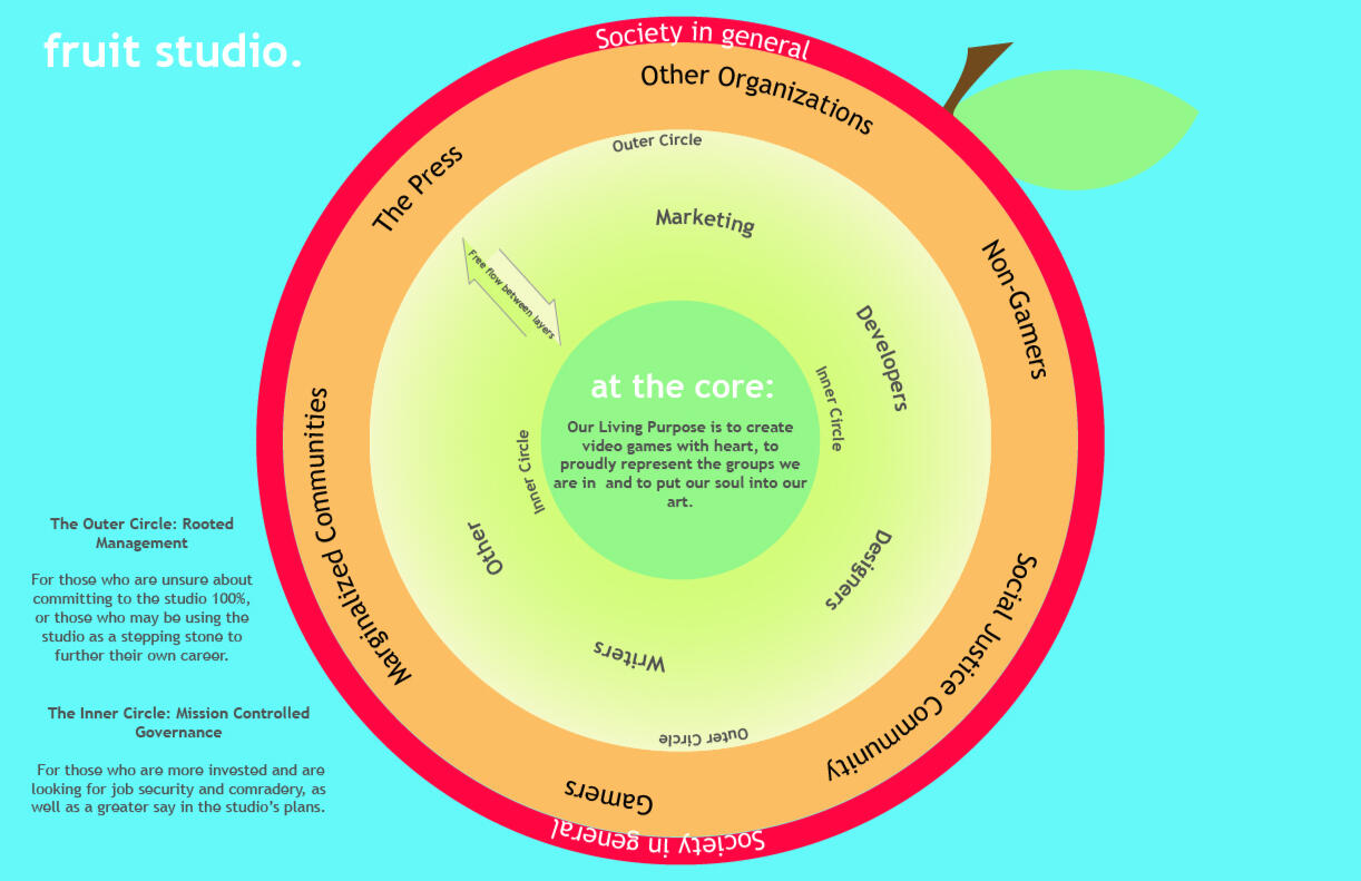
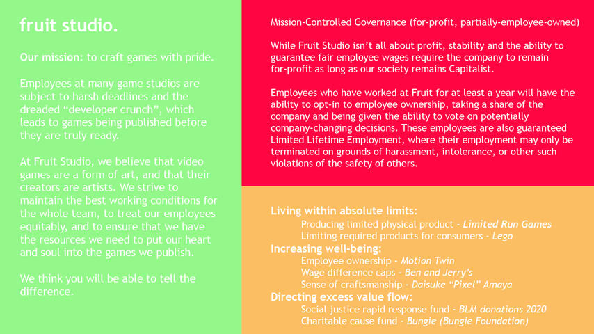
From there, the final slides were born.
Open During Construction
(MoPOP Soundboard Gallery, 2016)
One of the responsibilities of the Experience Music Project's Youth Advisory Board (now known as the Museum of Pop Culture, or MoPOP) was to curate the gallery known as the Voice Box: the only gallery in the museum accessible to the public for free.In 2016, my starting year on the team, we chose to use this display to highlight changes in the Seattle area. Growing up in a growing city led to a unique sort of worldview shared among my peers, and we hoped that taking photographs of the world around us, of the gentrification and the expansion, we hoped to share a glimpse into our world. Of the eight photographs used, three were taken, edited, and captioned by me.
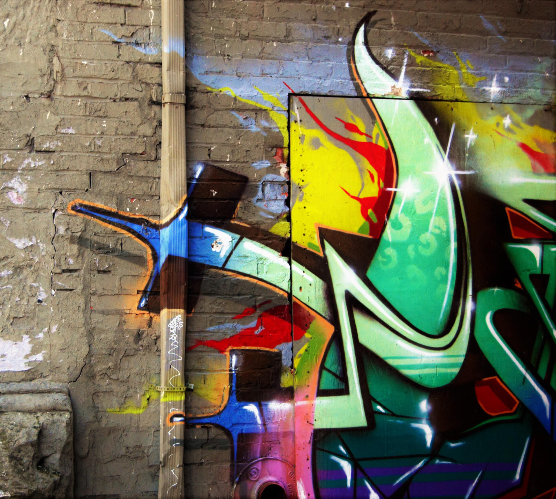
Graffiti
A rusted car door leaned against this painting, on the walls of an alley in Pioneer Square. Bold, and possibly illegal, it stands out against the beige and brick and cement that surrounded it. It, too, is art, as are the statues around the corner, and the pictures in the galleries that surround it.
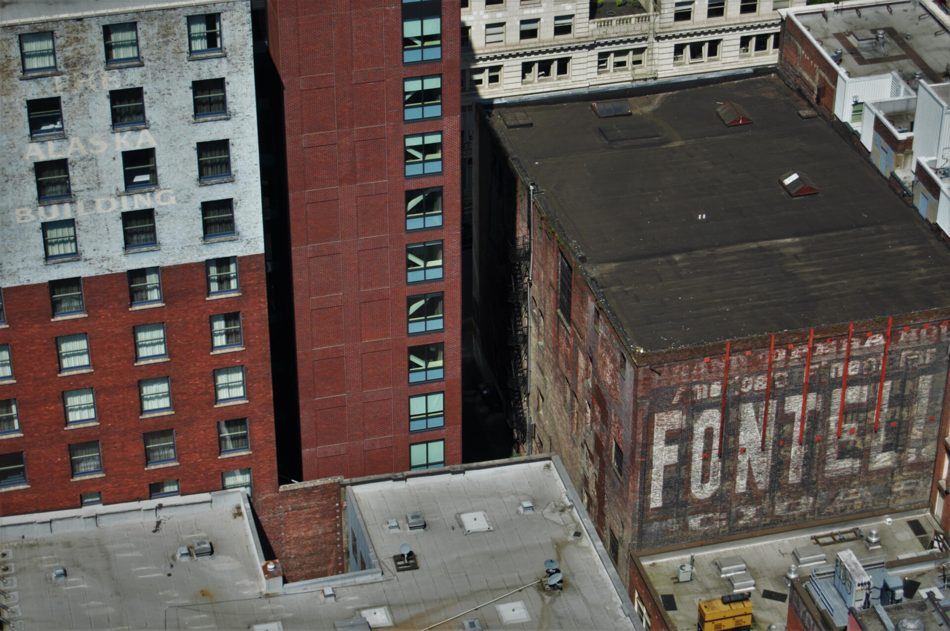
Alaska Building
Ghost signage is the term used for a title, painted directly on the wall. Taken from the upper floors of the Smith Tower, this image shows some of the oldest buildings in Seattle. This style of sign has shown a resurgence recently, carefully aged to lend a sense of antiquity to new businesses. Age is modern once again.
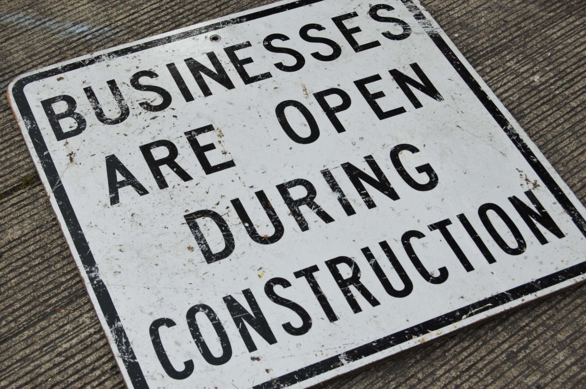
Sign
Found in the University District, this sign was flat on its back, slightly trampled, just to the side of the road. Despite the lack of a visible sign, nobody appeared to be under the impression that the businesses would be closed. Construction hasn't phased them, nor has it phased the people passing through the Ave near-daily. The drilling and hammering is as much a part of the usual noise as the birdsong in the spring.
Sign, the image above, ended up titling our exhibition: Open During Construction. It showed a sort of light through the darkness that weighed our thoughts, the resilience that we found as people continued living regardless of construction or corporate takeovers or rising rent.
Peer Advocate Application Flyers (2019)
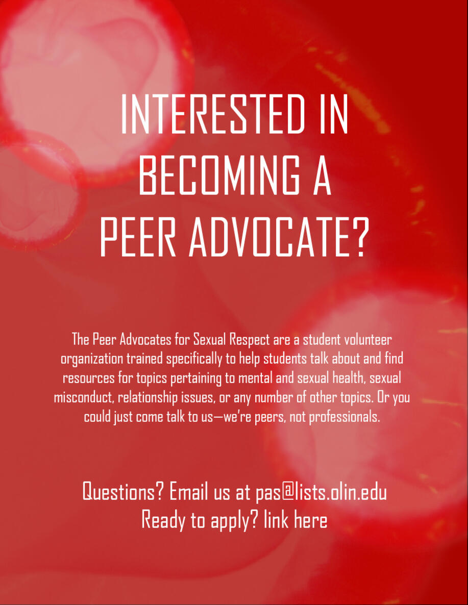
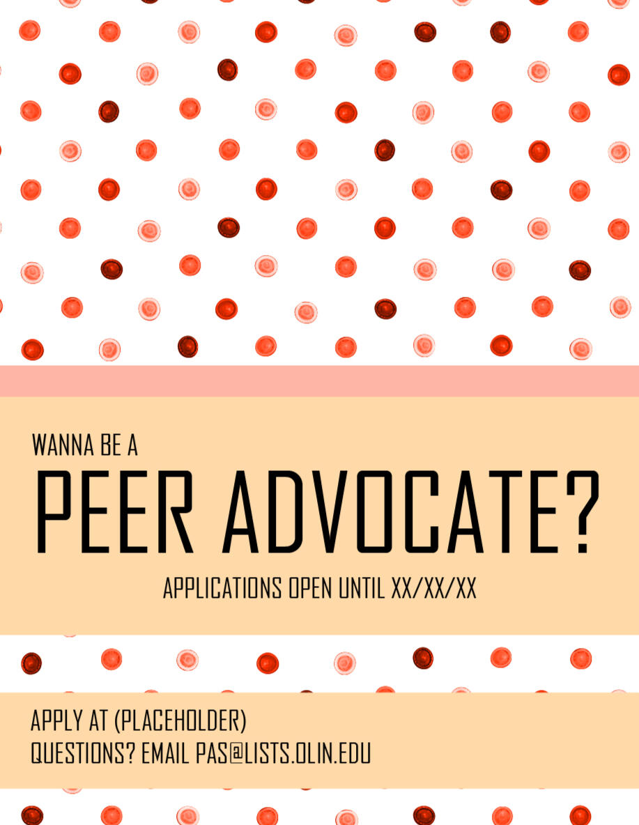
The Peer Advocacy (PA) program at Olin was started in order to give students on-campus peer support in cases of sexual assault. Over time, we broadened their horizons, offering relationship advice, providing sexual education, and, most infamously, offering condoms outside their rooms. When we began thinking about recruitment for the 2020 school year, I decided to take our most iconic offering and use it as a theme, creating the pair of posters above. The image on the left would have served as an email out of respect for the school's printers, while the one on the right would have been posted in the dorms and at the dining hall. While these posters did not end up seeing actual use during my term, the templates have been saved for potential future use.
Snowy Village AR Filter (2021)
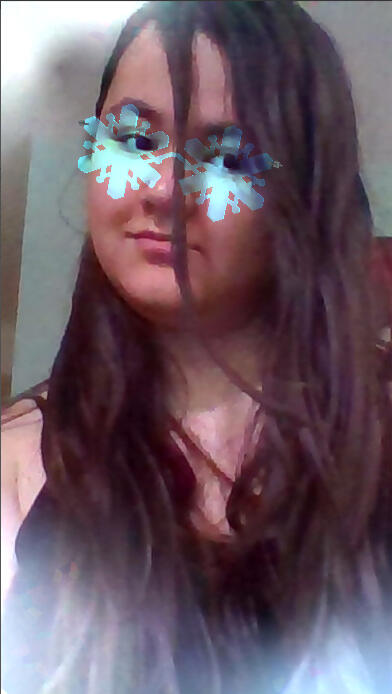
I was tasked with making an Instagram filter for the opening of a Snowy Village bingsoo shop in Renton for a family friend. We discussed a variety of options, with interest in a "kawaii" look, and brainstormed materials for the sheet on the right. We ended up settling on an AR filter that puts a pair of snowflake-shaped glasses on the user, which can be both cute and sophisticated, and doesn't obstruct the background.Once we had settled on the design, I sketched the frame of the glasses in Illustrator, imported it to Blender, and started modeling.
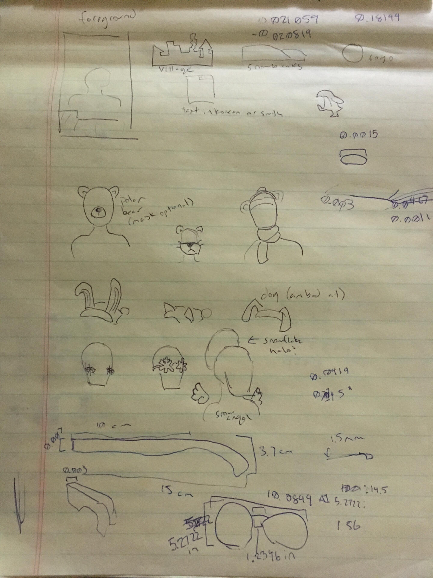
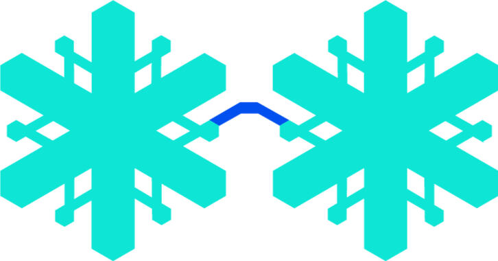
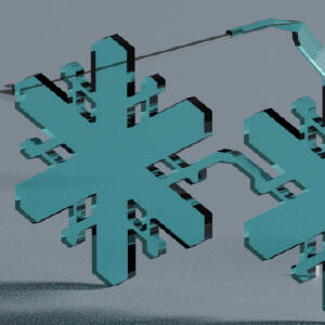
Using two of my own pairs of sunglasses as reference, I created the model shown below. From there, I added the asset to Spark AR Studio and began placement.
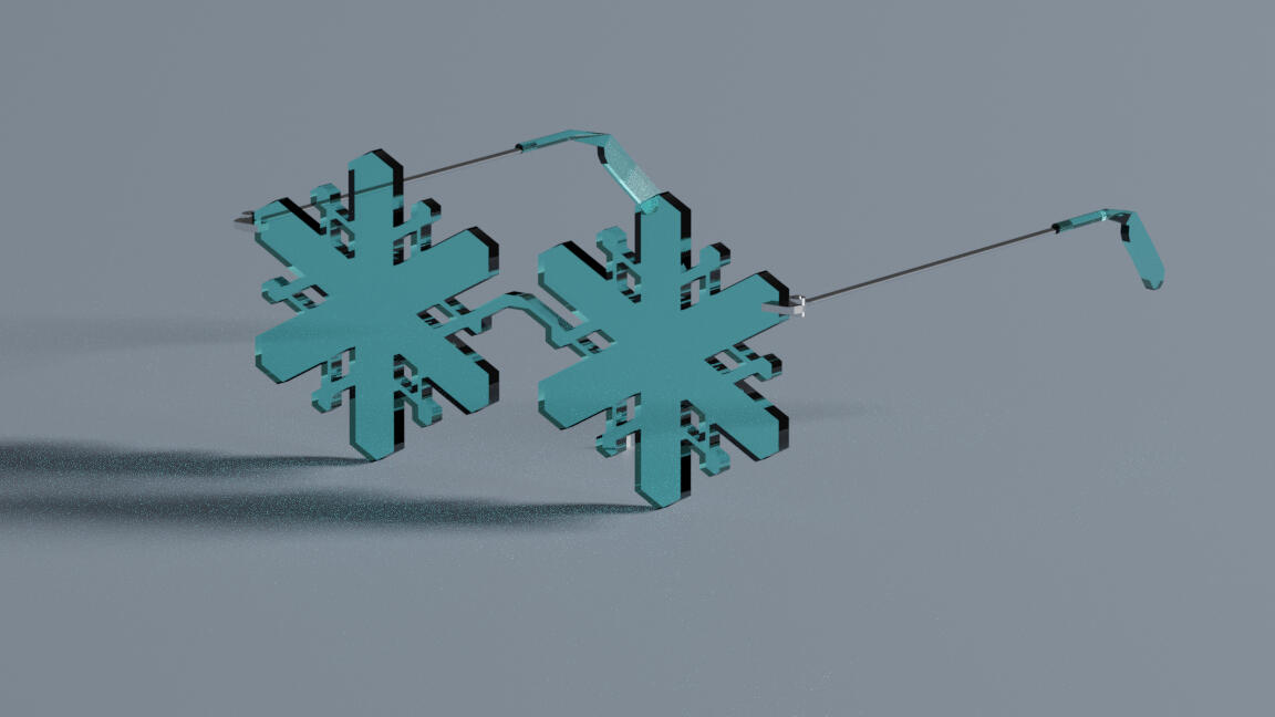
However, the glasses alone didn't quite create the effect I was looking for. Sunglasses, though cute, didn't quite bring the "chill" factor I wanted, especially with the planned opening being in the summer. The solution ended up being a foreground layer of frost, which I created in Illustrator. With that added, I was able to hand the filter off to the shop's owner.

Miscellaneous Personal Projects (2017—)
The gallery below shows several smaller projects which I have worked on for fun over the past few years. Click on each image to read more.
Miscellaneous School Projects (2018-2021)
The gallery below shows several smaller projects which I have worked on during my time in school. Click on each image to read more.
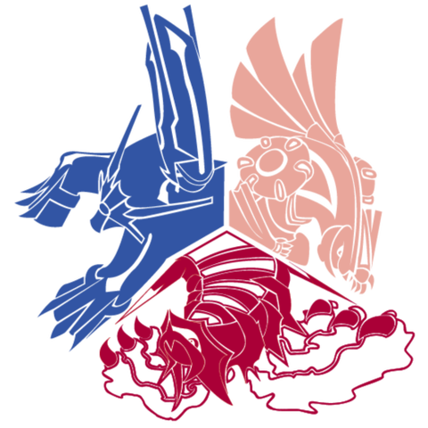
Sinnoh Gods (2017)
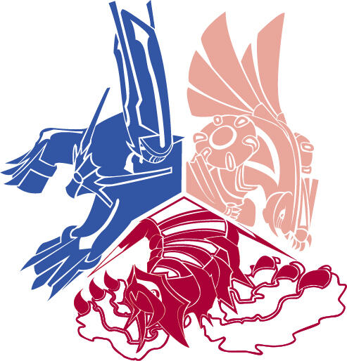
An Illustrator warmup that ended up becoming its own project. I drew this sketch in my notebook, scanned it to my laptop, then traced and edited in Illustrator.

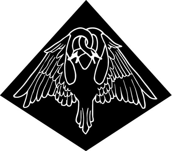
Twin Swans (2018)
I don't remember the exact process behind this one, the only thought behind it was to create a cool-looking sticker for my laptop.
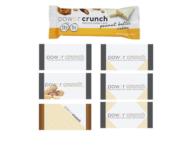
Power Bar Redesign (Tell The Story, Fall 2020)
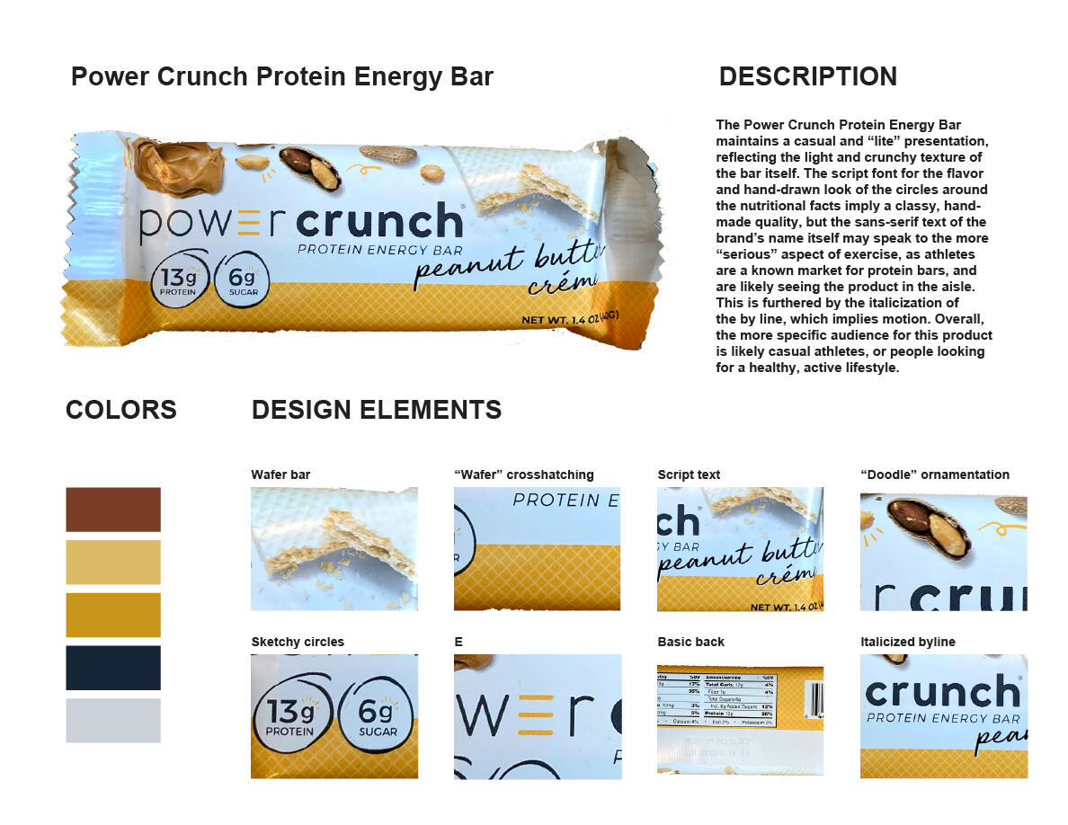
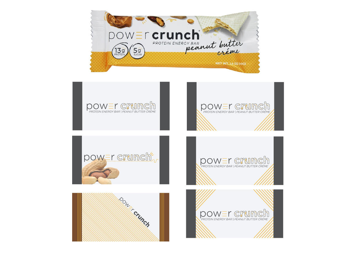
This project was part of a graphic design course, which had many small assignments throughout the semester.This was the first assignment of the semester, and was created in part to tell how well we could follow rules. The left image was given to us as a template populated by a different protein bar, and we were given our choice of bar to complete the assignment with. From there, we were told to take some elements we had highlighted, and create a new design for smaller sample bars. I chose to focus on the "wafer" crosshatching and trying to balance the neatness of the title font with the "carefree" energy lent by the more scriptlike elements.
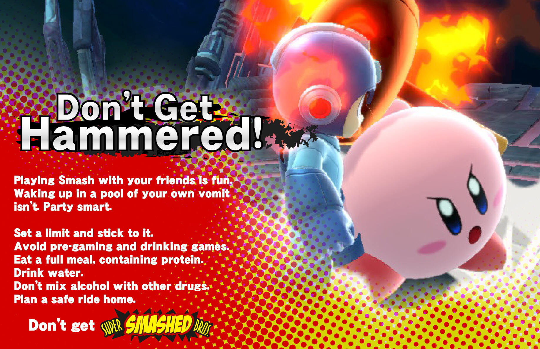
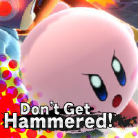
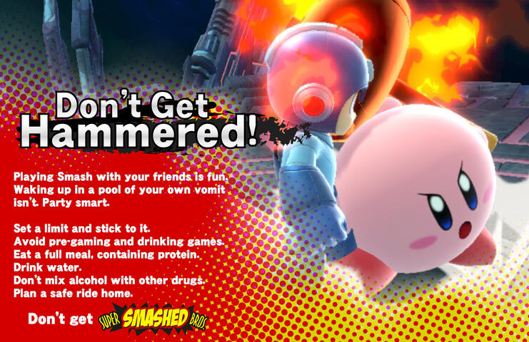
Don't Get Hammered! (Tell The Story, Fall 2021)
This project was part of a graphic design course, which had many small assignments throughout the semester.This assignment was based on a poorly-received anti-binge-drinking campaign ran by our neighboring college, Babson. Based on Nintendo's hit Super Smash Bros series, we were told to create a poster that was more convincing than just the slogan alone. As a casual Smash player, I had a lot of fun with this poster, taking the screencap used in the poster myself, and doing my best to mimic the text treatments used in the Smash games and trailers.
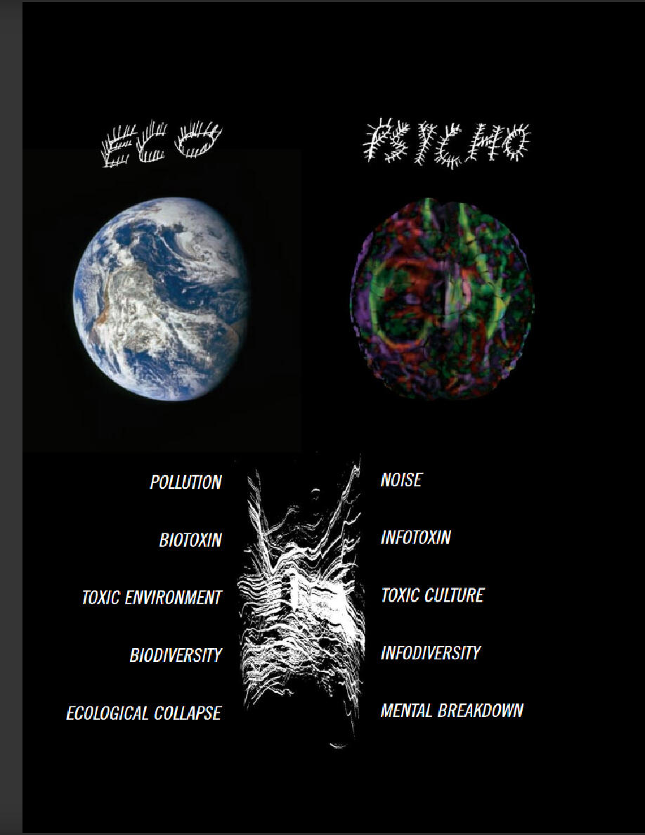
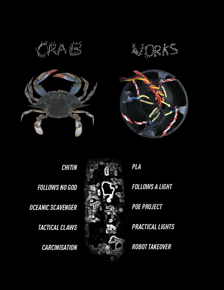
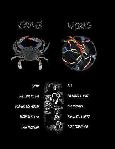
Crabworks Study (Tell The Story, Fall 2020)
This project was part of a graphic design course, which had many small assignments throughout the semester.This assignment was focused on making sure that we could follow a pattern set by another designer; in this case, a magazine of our choice. We were to take a cover, page, or spread, and replicate it detail-for-detail, but instead talk about a project from a previous class. I chose the Eco Psycho spread from an issue of Adbusters that I unfortunately do not remember the exact number of, and worked with the Crabworks light-following robots produced by some of my friends in their Principles of Engineering class.
FitBetter (Sustainable Design, Spring 2021)
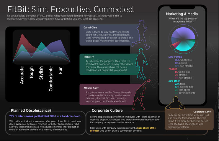
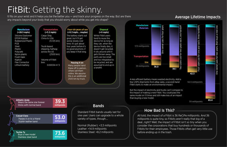
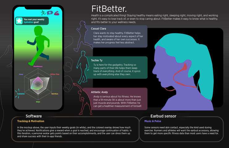
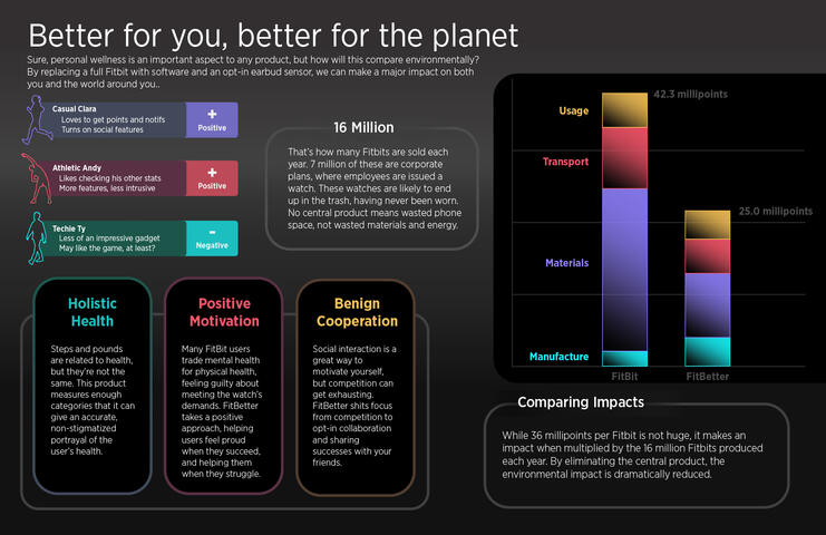
This project was part of a sustainability course. We were given half the semester to study a product and its userbase and to come up with a more sustainable alternative.My team chose to work with smart fitness trackers, focusing on the FitBit brand. We submitted three rounds of posters: the first of which shows the personas we formed based on user interviews, the second shows a ReCiPe point teardown of the device throughout its lifetime, and the final two presenting our chosen solution.The initial blue, green, and red colors were originally sampled directly from an example FitBit screen, with orange, pink and lime being added later on to broaden the palette. The rounded corners were also a callback to the general rounded design of smart devices.This is one of the projects I contributed to most heavily in the visuals department, and, while there is still plenty of room for polish, I am quite proud of how the posters turned out, particularly the first two.
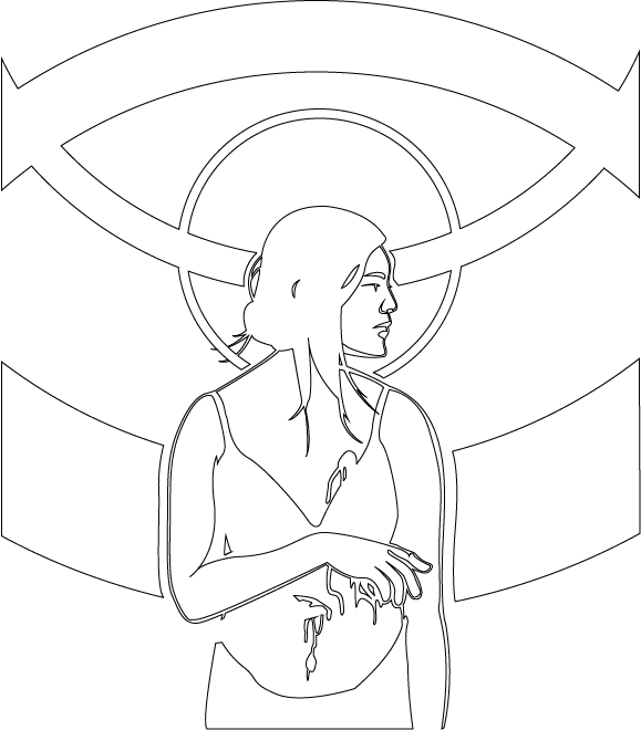
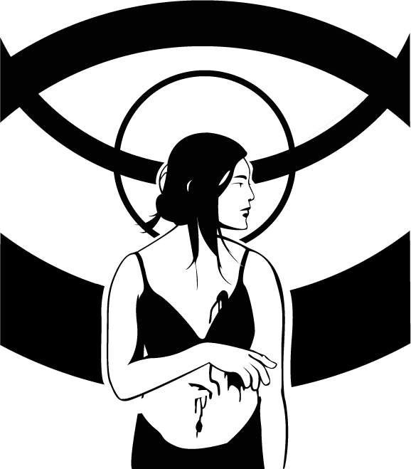
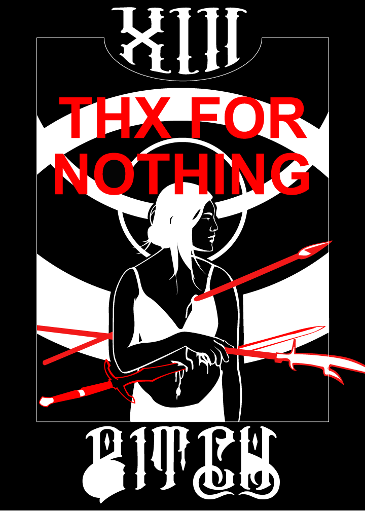
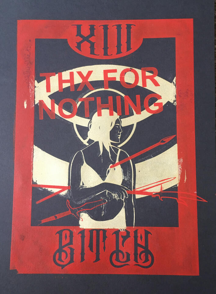
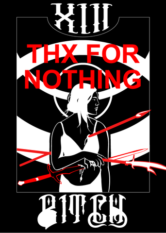
Thx For Nothing (Creativity Practicum, Fall 2019)
This assignment was the final for an arts course in which we curated a personal sense of style in all five senses. The final project was to create an art print which would be distributed to the class.I will admit that this is a piece of vent art that I ended up liking enough to produce over 30 prints of. By the end, though, I was quite happy with myself and with the final product. The assignment had specified that these were supposed to be spray painted, but since screen printing lends itself much better to the process of mass-production, I decided to silkscreen instead. None of the final product looked alike, which I ended up liking quite a bit. The border was sometimes purple, the center ranged from white to gold, and the titular "THX FOR NOTHING" was never properly aligned.
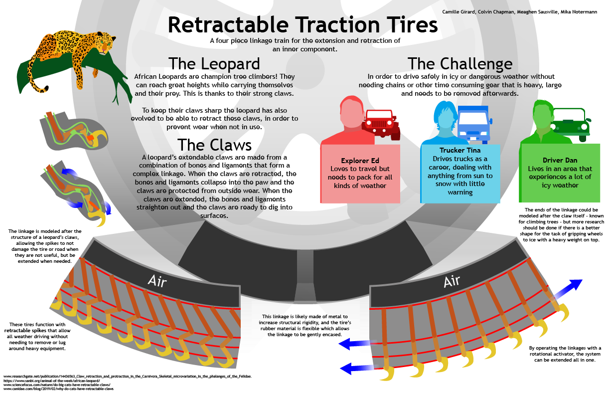
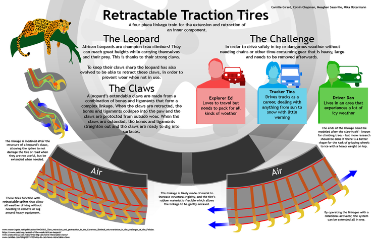
Retractable Traction (Biomimicry, Spring 2020)
This assignment was the culmination of two weeks of teamwork, where we found a natural tool to emulate, and invented a product that could use it.Spending a week studying the claws of the leopard, one of the most powerful tree climbers in the animal kingdom, my team ended up proposing a set of linkage trains that could be straightened by inflation of the tire, causing the claws to emerge for snow traction.While this isn't my favorite piece, I feel like it does a great job of highlighting the basic skills I've been honing. The parts of the claw are color-coded and match the parts of the linkage in the tires, the personas are distinguished in multiple ways (color, vehicle, name), and the background is simple but not boring.
Various (Affordable Design and Entrepreneurship: Global Health, Spring 2020-Spring 2021)
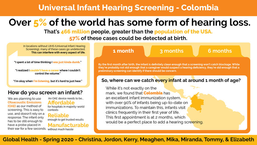
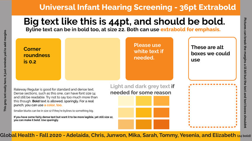
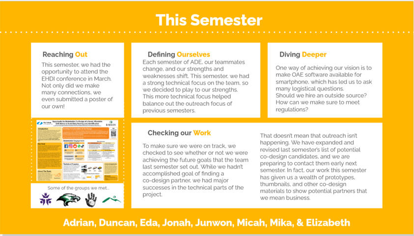
This was my capstone class, which I took for three semesters. We were partnered with the organization Solar Ear, and were looking to make an affordable device that would make universal infant hearing screening viable in the near future.My work in this class has been quite varied, between the start of remote learning and the skills of my teammates, who rotated each semester. When I joined the Global Health track, a slide deck had already been selected for our presentations, its orange color distinguishing us from other tracks in the same class. Since orange had become our defining feature, it made sense that we continue using elements of the slide deck outside of presentations.The first and second images in the gallery are the template and poster I made for the final discussion of my first year. Since then, the colors have been tweaked, with users of the Flux application noting that the light red-oranges were hard to see, but the template remains in use even past my graduation. The third and fourth images were slides that fulfilled a similar role to the posters above, though adapted to a remote context.The final image was a variation on the theme that was created for our team's assigned snack week, where we made foods to promote hearing health and served them on 3/3: WHO's World Hearing Day.
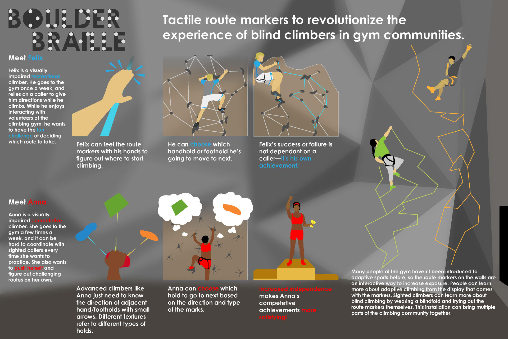
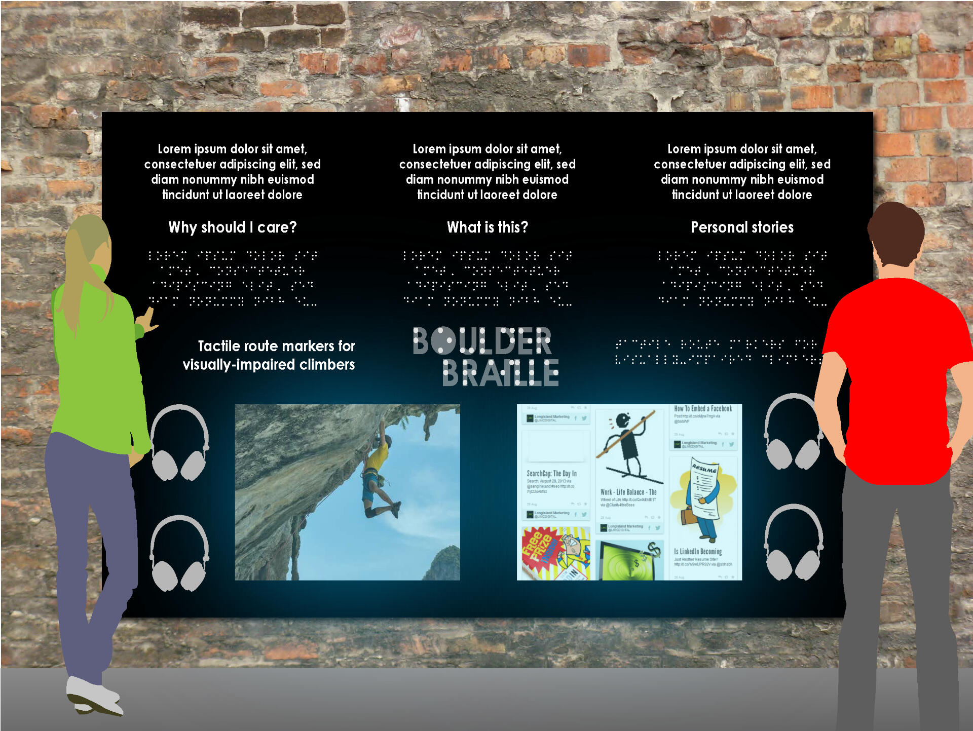
Boulder Braille (User Oriented Collaborative Design, Fall 2018)
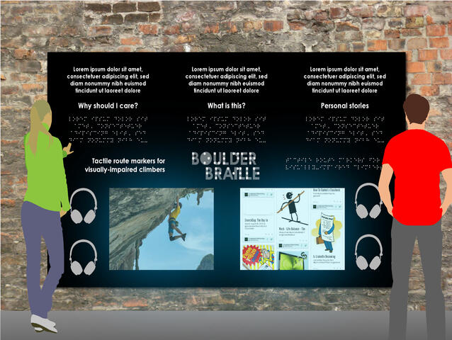
This is one of the most iconic classes at Olin, where teams are given a target group to research and come up with a product proposal by the end of the semester.My team for UOCD was given the task of fulfilling a need for adaptive athletes, a field we ended up narrowing to visually-impaired rock climbers. Unfortunately, many of our physical materials no longer exist, but our personas of Anna and Felix were around since our first progress review, where they had been drawn in the colors they wear in the final poster. Their colors also correspond to the archetypes they personify, with Felix's blue matching his casual commitment, while Anna's red showcases her competitive nature.The product itself would be paired with a board, shown in the second image, where braille is given its own space, serving to bring awareness to sighted climbers of their non-sighted peers. This mockup was presented alongside the poster and a few examples of possible tactile trails at our final event.
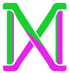
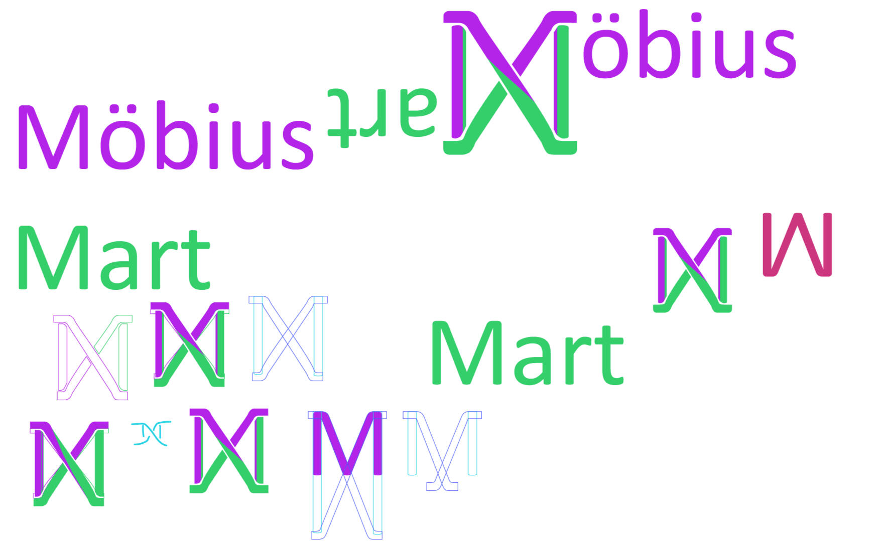
Möbius Mart (Personal Project, Summer 2022)
In my free time, I enjoy playing tabletop RPGs with my friends, from classic titles like Dungeons & Dragons to more abstract games, such as Troika. In mid-June of 2022, a year-long campaign wrapped up, and some of my friends proposed we gave our Dungeon Master a breather and run a series of short games for our group. I've always been fascinated with the concept of being lost in an Ikea, and ended up creating a one-shot based on that idea. Of course, it only seemed fitting to give the location a logo, especially since many of the friends I game with took the same design classes as I did.This design took about three hours to finalize, based on an original idea where the crossing "M"s looked like the twist in a Möbius strip. My design process is shown in a rather jumbled order in the image below. I wanted bright colors to evoke the "generic brand" feeling, and I wanted to stay away from colors that were commonly used in actual logos, because I wanted to show that the inside of the store is more than a bit unhinged.As of writing this, I have not yet ran Möbius Mart, but I do intend to use the logo for more than just a title card. When it has been completed, I am considering releasing the full adventure, maps, logos, and all, as a 5E Module on my Itch.io account.
Free Comic Book Day 2022 Poster (Carroll Lower School, Spring 2022)
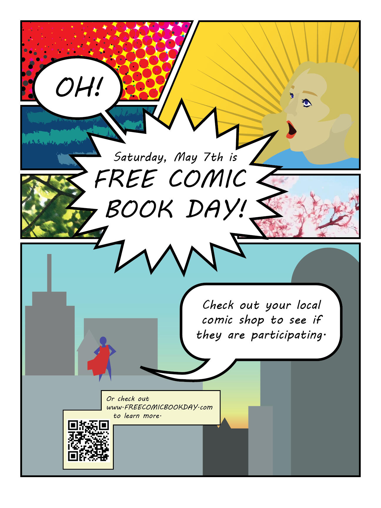
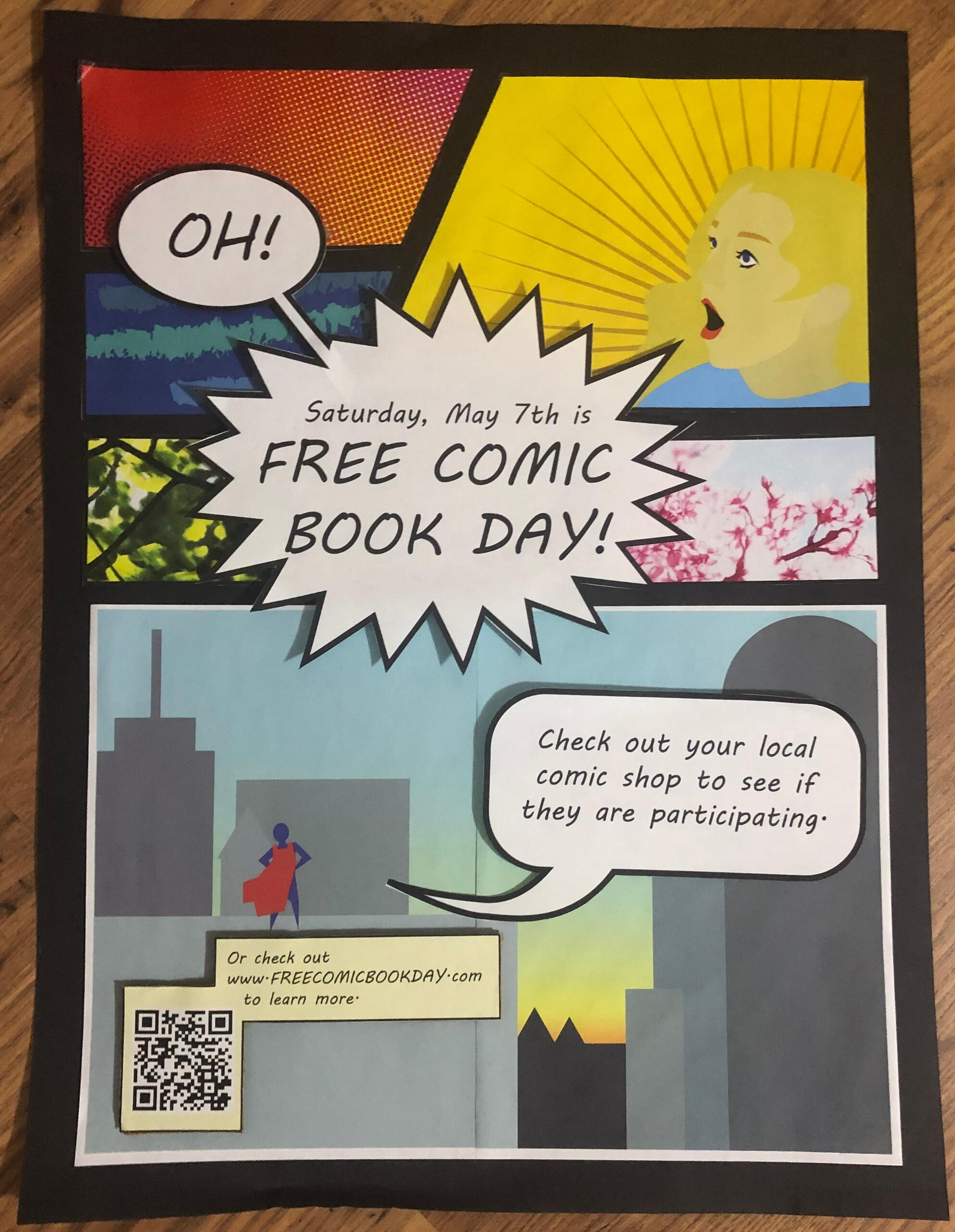
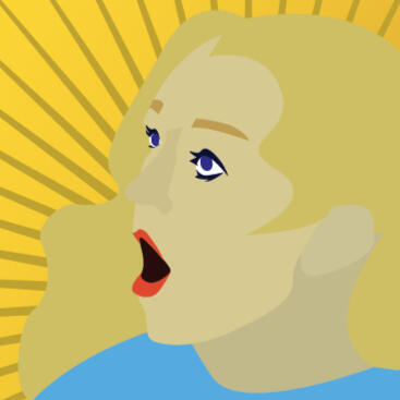
I took on this project in early May of 2022. I was working at the Carroll Lower School as a TA, but spent a majority of my time in the library, helping cover for the main librarian who was recovering from an injury. Carroll is a school specifically for children with reading challenges caused by disorders such as dyslexia, and aims to help them gain confidence both in reading and in existing in the world as a differently-abled individual. I had noticed that the graphic novel section of the library, though far from robust, often saw the most traffic from kids who were choosing books for pleasure, and realized that an event like Free Comic Book Day could be a great way to let the students find things they wanted to read without putting financial strain on parents.That said, I got approval for this poster a week before the event was to happen. I completed this design and its execution in around four hour, in order to make sure the sign could go up first thing on Monday, giving the kids five days to get word to their households.I was, of course, inspired by comics in my design, but I was also trying to work around the fact that no printers at the school could print in the dimensions I wanted. The solution was to print out the panels individually, cut them out, and paste them to a 18" x 24" poster. I cut out the text boxes individually as well, and attached them to a layer of cardboard to give them emphasis. I also included a QR code, as I knew many of the students would have a difficult time typing the url, and that all students had access to laptops, which they knew how to access the QR reader through.
Rethinking the PHON BOX (Carroll Lower School, Spring 2022)
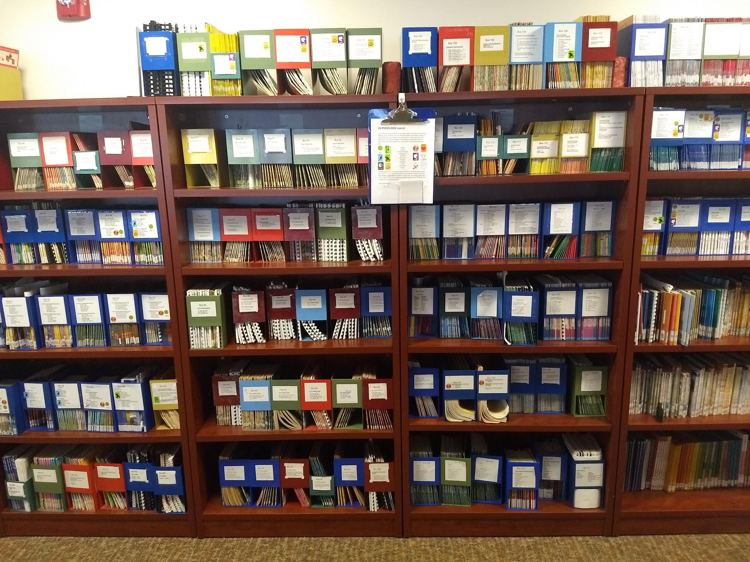
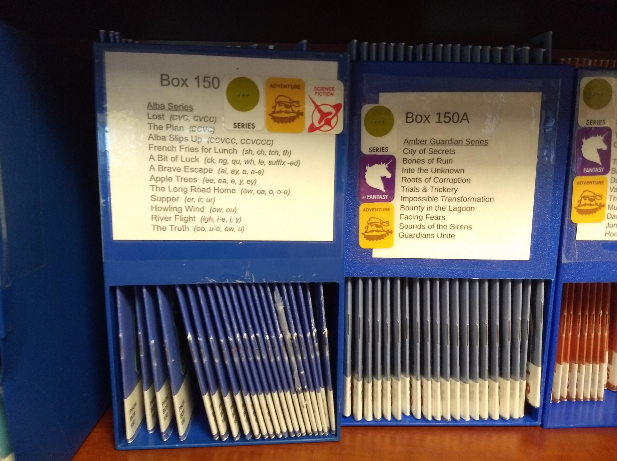
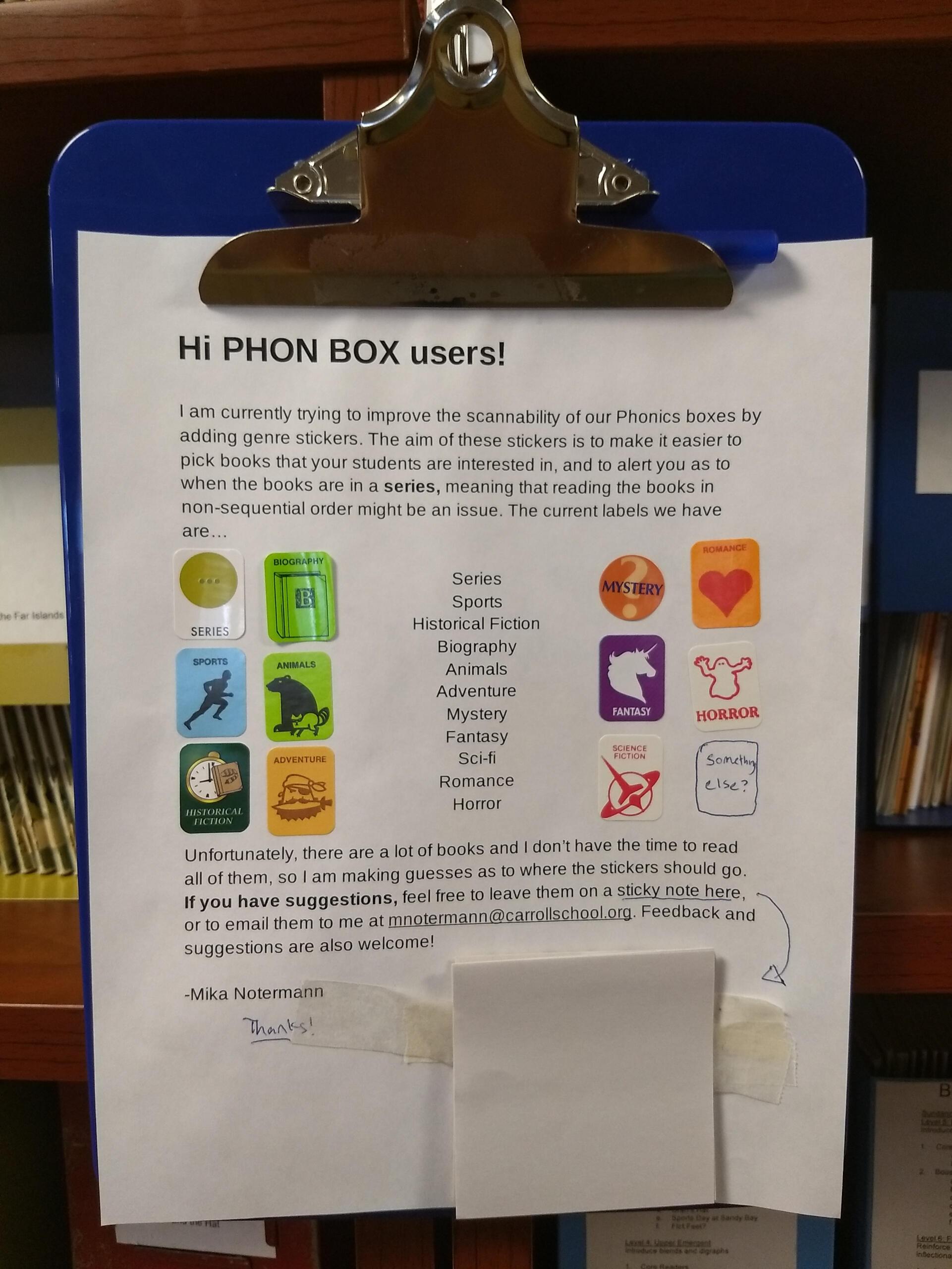
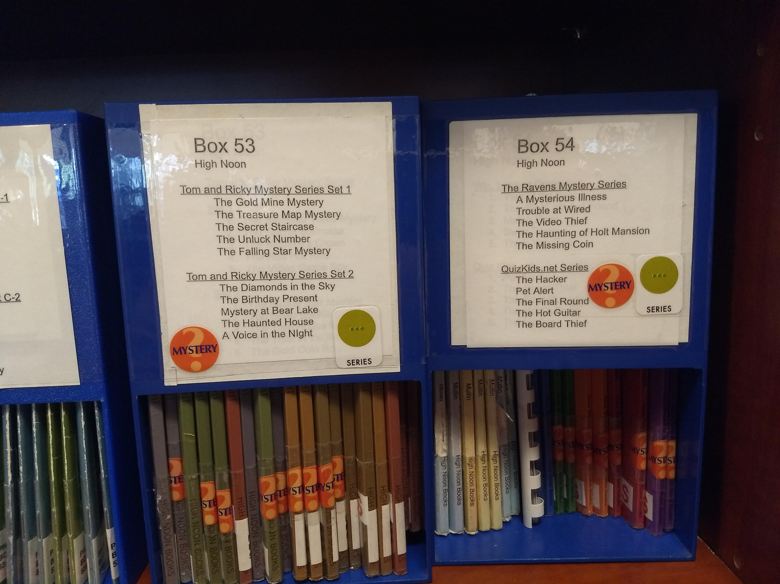
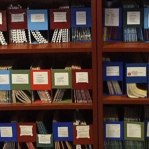
While working at Carroll Lower School in early 2022, I ended up spending a majority of my time in the library, covering for the head librarian, who was recovering from an injury. As I became more familiar with the systems in place, I began to discover flaws. One such flaw was in the organization of the Phonetics books section, or the PHON BOXes.Carroll School provides a tutor for each student, and the library is the number one resource that these tutors have available. The PHON BOXes contained a multitude of easy-to-read books that were designed specifically for teaching phonetics, offering several options at each level. Problems began to arise when newer tutors, who had not had the time to read through the collection, would work with picky kids. Despite the equivalent reading lessons in a PHON book about ponies and a similar one about pirates, some children would refuse to read one or the other based solely on preference. This left their tutors to stare at the wall of PHON BOXes and scan each individual box for a title that might appeal to their student.After talking to a few tutors in those situations, I realized that the library already had a tool that could help: genre labels. Though some of the PHON books themselves had a label identifying them as mysteries or biographies, these labels were obscured when the books were in their boxes on the shelf. I began to put the stickers on boxes where the whole collection was of a single genre. Adventure, fantasy, sports, and animals were the four that were most common, and for the most part, the students in the elementary age range like at least one of those categories. I left a clipboard with sticky notes and my email address for feedback or suggestions.The response was immediate, though subtle. I did receive some passing thanks, but I noticed that conversations about finding PHON BOX books for stubborn readers stopped entirely. Some of the sets that had received labels began to gain traffic as time went on, despite the fact that I rarely saw them checked out earlier in the semester. All in all, I considered the project a great success, and I know that it will be carried on in my absence.
